Brochure Mockup, Folded View, by Christine G. Adamo of WriteReviseEdit.com

1,000 Words? Pics of Recent Projects

freelance writers, freelancing, Graphic Design, Illustrator, InDesign, layout & design, Photoshop, professional writers, proofreading, revisions, Uncategorized, writers, writing, writing advice

1,000 Words? Pics of Recent Projects

by Christine G. Adamo

Is a picture really worth 1,000 words? You be the judge!

The images included here form a gallery you can peruse at your leisure. These pics and the projects they’re related are discussed in greater detail in individual Write Revise Edit blog posts here at WordPress. If you like what you see, let us know! If you wanna see more? Follow our blog.

If I could just sell my work at a rate of $1,000/word (or image) I’d be set!

A girl can dream, can’t she?

Christine

Branding Guidelines Cover Sheet created by Christine G. Adamo of WriteReviseEdit.com

Establishing Brand & Identity Guidelines

freelancing, Graphic Design, Illustrator, InDesign, layout & design, Photoshop, professional writers, Uncategorized, writing, writing advice

Establishing Brand & Identity Guidelines

by Christine G. Adamo

What’s your brand? Your identity? Do you even have ’em? It’s likely!

Whether you own a business or are simply going about your business, your brand and identity are inextricably linked with your personality. They’re what tell other people whether you’re friendly, raucous, outspoken or demure. The way you package yourself (via product design or personal effects) speaks volumes.
 

EX 4 - Brand Guidelines (1)

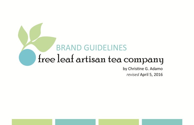
Brand guidelines ensure that you send a consistent message to consumers, lenders and even the media. (Created by WRE’s Christine G. Adamo using Adobe Illustrator, InDesign and Photoshop)


The guidelines I’m sharing here are for a fictitious company.

But nearly any business, publication or endeavor can benefit from a set of guidelines for logo use, color schemes, typography and more. By consistently adhering to those guidelines, you help others take you more seriously. If you’re looking for a loan, I recommend bundling such guidelines into your business plan.
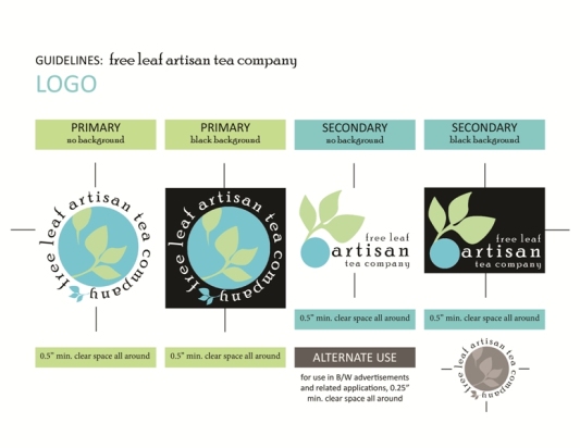
 

EX 4 - Brand Guidelines (2)

Notice how every page of my free leaf brand guidelines is built upon the same general template. I intentionally repeat colors, fonts and art elements so that it’s cohesive. (Created by WRE’s Christine G. Adamo using Adobe Illustrator, InDesign and Photoshop)


So, you know you need a set of brand guidelines. But what do you include?

What I initially included in the brand guidelines I’ve shared here (beyond a cover page, that is) were pages for: logos (w/alternate designs), color palette, typography and graphic elements. What I later added were consumer packaging and staging. Just about any client can benefit from at least a few of these elements.
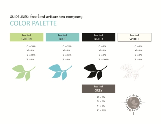
EX 4 - Brand Guidelines (2b)

Making note of CMYK, RGB or other color specs ensures that no matter who designs what the results will be the same. BTW, this is no time to wield an ego. (Created by WRE’s Christine G. Adamo using Adobe Illustrator, InDesign and Photoshop)


I’m going to play devil’s advocate here and say it for you: Why should I care?

Good question! Designers sometimes worry about becoming obsolete. In other words, say I establish a set of branding guidelines for you. Within it, I detail every color, font and image you’ll ever use in subsequent marketing materials. What’s to stop you from having someone in-house do the work for you?
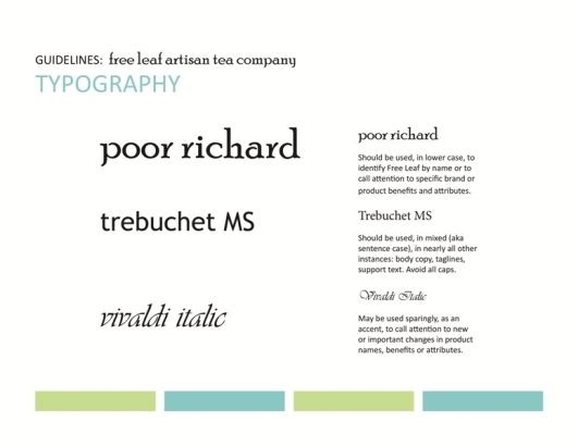
 

EX 4 - Brand Guidelines (3a)

At a minimum, every business – and, more importantly, every publication – needs a set of typography guidelines. Without them? You’re just floundering. (Created by WRE’s Christine G. Adamo using Adobe Illustrator, InDesign and Photoshop)


Nothing. But your in-house designer has clearly dropped the ball already.

Hmmm. See where this is going? Don’t be so fearful that you wind up doing your clients a disservice. In the end, guidelines also make life easier on you. And creating them takes time and effort. That’s billable time I’m talking about. Get paid to do your clients and yourself a favor, why don’t you! It’s about time, right?
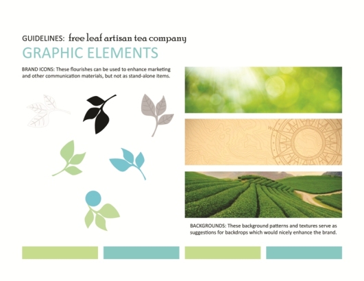
 

EX 4 - Brand Guidelines (3b)

NOTE: Yes, guidelines should set a universal standard. But don’t treat them as if they’re etched in gold. Revist and update them at least once a year. (Created by WRE’s Christine G. Adamo using Adobe Illustrator, InDesign and Photoshop)


While we’re on the topic of what you can do for your clients – and yourself …

There’s no better time to mention that, when you’re working for a client, you really need to check your ego. It’s not your project your working on. It’s theirs. They need to be happy with the outcome. They need to trust that you took their concerns seriously. They need to know you have their best interests in mind.
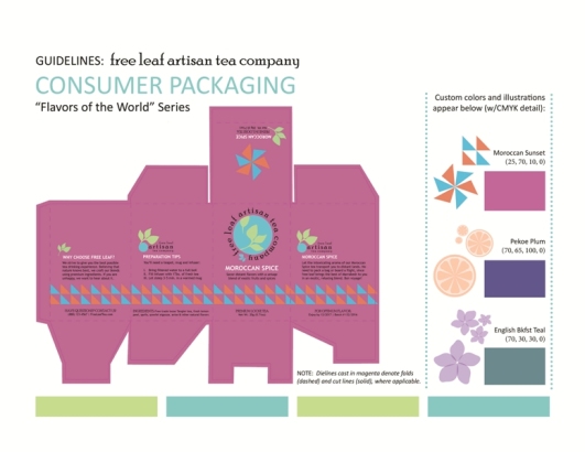
 

EX 4 - Brand Guidelines (4a)

Avoid making your brand guidelines boring. Let loose! Make them something you’ll want to refer to again and again. Because you’ll probably need to! (Created by WRE’s Christine G. Adamo using Adobe Illustrator, InDesign and Photoshop)


If you don’t, why bother working for them? Work on your own stuff instead!

I’m being cheeky here, but I’m trying to drive home an important point. Why would anyone pay you to force your own agenda on them? Or their clientele? Collaboration and brainstorming aside, if I have needs which must be met, I want you to meet them. Be creative, but don’t force your brand on mine.
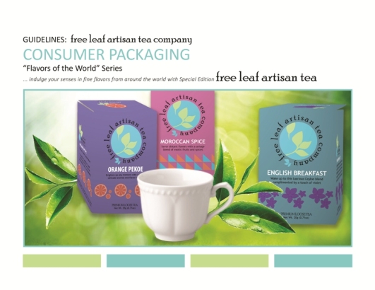
 

EX 4 - Brand Guidelines (4b)

OK, so I’m no wizard when it comes to forcing perspective on flat images. Glitches aside, using Adobe products to bring mockups to life is a lot of fun. (Created by WRE’s Christine G. Adamo using Adobe Illustrator, InDesign and Photoshop)


An even better strategy is to work with clients who “get” you.

They’re out there. They exist. Believe me, they do. It’s not always easy to find them. But, the minute you cut a client (who’s a bad fit) loose, you’ll stumble right into one who thinks you’re the cat’s meow. And there are few better feelings than knowing that clients thoroughly appreciate the work you do for them.

Now get out there and find an identity to brand – with guidelines no less.

If I can do it? You can!

Christine

Christine G. Adamo | Owner, Lead Writer & Designer | http://www.WriteReviseEdit.com


Brochure Mockup, Exterior Panels, by Christine G. Adamo of WriteReviseEdit.com

You’re Invited! Brochure Design

freelancing, Graphic Design, InDesign, layout & design, Photoshop, Uncategorized, writers, writing

You’re Invited! Brochure Design

by Christine G. Adamo

Not sure how to design a brochure? Let InDesign make it easier on you.

I recently embarked on a mock brochure design project. My goal was to highlight the Design for Social Innovation MFA program offered at the School of Visual Arts’ NYC campus. The essential data and basic stats were available on the SVA website. They also had an existing logo, which appears in print/online.

What was more challenging was finding a way to make that info inviting.


PROJ 4 (2)

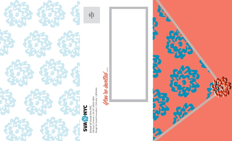
EXTERIOR: A mock brochure designed to promote SVA’s Design for Social Innovation MFA program in NYC. (Created by WRE’s Christine G. Adamo using Adobe InDesign and Photoshop)


Let me confess something here and now: I’m sometimes afraid of color.

I wear a lot of black, brown and grey. I also use color sparingly in my designs for fear that it might scare people away. This project definitely pushed the envelope. Pun intended. And that’s a good thing! I wanted this to be easy to mail (I’m fairly pragmatic) and wanted to leverage SVA’s existing art in a way I hadn’t seen yet.


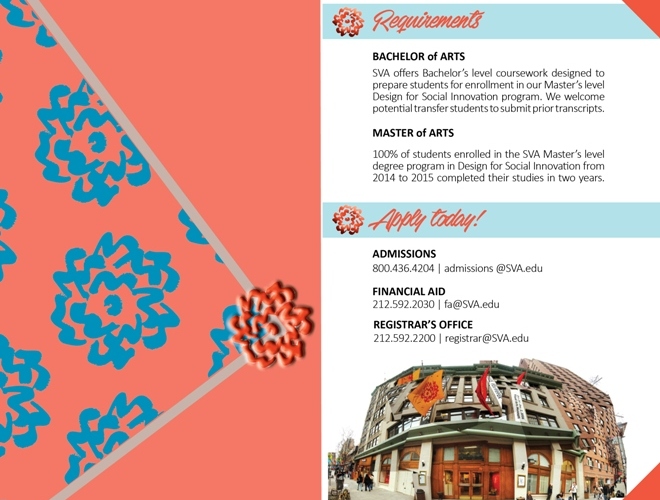
PROJ 4 (1)

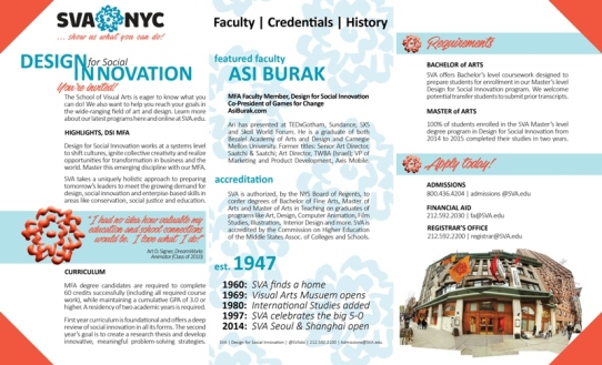
INTERIOR: Essential info needed to appear on the inside panels of this mock brochure, which is why I opted not to cut the outside panel at an angle. (Created by WRE’s Christine G. Adamo using Adobe InDesign and Photoshop)


The results came about using Adobe InDesign, which only sounds scary.

Most of Adobe’s design products (Photoshop, Illustrator, InDesign, etc.) are intimidating to ease into. Their controls and tools don’t behave in what I’d consider to be intuitive ways. Not on the surface, anyhow. Once you get past some of the peculiarities, however, those things do elevate your resulting designs.


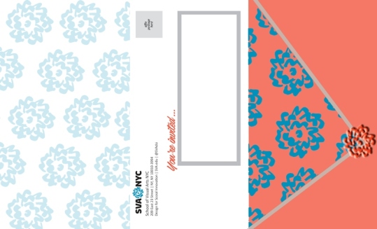
FOLD OVERS: On one hand? We have the L inside panel alongside the R outside panel. On the other? The L outside panel alongside the R inside, as if it’s folded over. (Created by WRE’s Christine G. Adamo using Adobe InDesign and Photoshop)


Ultimately? Something like this should appeal to both students and parents.

I mean, let’s face it. Someone pursuing this degree program will need a lot of financing. More often than not? Mom and dad are gonna have to get involved in making the decision and say “Yay” or “Nay.” If SVA were my client, I’m certain they’d want a brochure that’s as broadly appealing as possible. And colorful!

What about you? Would this brochure make you want to know more?

You’re invited. Tell me why. Or why not!

Christine

Christine G. Adamo | Owner, Lead Writer & Designer | http://www.WriteReviseEdit.com

Promotional Poster Mockups (for a series of local theatrical performances) by Christine G. Adamo of WriteReviseEdit.com

Designing Around a Theme

freelancing, Graphic Design, Illustrator, InDesign, layout & design, Photoshop, Uncategorized, writing

Designing Around a Theme

by Christine G. Adamo

When it comes to designing for clients, it helps to have a theme in mind.

What do I mean by a theme? A unifying thread that connects diverse marketing materials and conveys, in an instant, that those varying pieces are part of a larger whole. That’s what designing for Black Friars Theatre (Rochester, NY) was like. While they did not choose my design, I appreciate the designs they DID choose.

I also learned a lot in the process. In particular, what theatre design requires.

PROJ 1 - POSTERS ONLY Poster Design

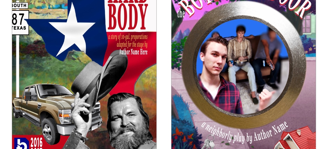
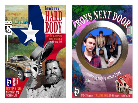
Black Friar’s poster mockups, intended to promote two separate plays from the same season. (Posters created by WRE’s Christine G. Adamo using Adobe Illustrator and Photoshop)


The posters I presented were well-received. And I was certainly proud of them. In the end, I was true to my own aesthetic and unified the designs by incorporating: similar color schemes, identically-sized logos, the same decorative and san serif fonts and a photomontage feel that incorporated interesting details.

I also learned that Photoshop is tons of fun to monkey with, but I digress!

What I failed to do, or found challenging (as I’m not much of a playgoer and didn’t factor in sufficient time for related reserach), was consider how they might later translate into playbills, ticket stubs and other theatre-specific marketing materials. Take a look at any playbill and you’ll see that illustrations dominate.

Why? The essense of a play’s message must be iconic. Illustrations do that well.

Live and learn!

Christine

Christine G. Adamo | Owner, Lead Writer & Designer | http://www.WriteReviseEdit.com


Non-Western Design Survey by Christine G. Adamo of WriteReviseEdit.com

Other People’s Work: Why It Matters …

freelancing, Graphic Design, Illustrator, InDesign, layout & design, Photoshop, Uncategorized, writing, writing advice

Other People’s Work: Why It Matters … & Why You Should Care

by Christine G. Adamo

What can we learn from other people? A whole lot, as it turns out!

Consider the world of Visual Arts and Graphic Design. By the time an artist has achieved a level of recognition that’s worthy of their talents, they’ve typically endured years of rejection. If not rejection, you can at least be sure they’ve spent countelss hours toiling on projects not one other person is ever likely to see.

Quite possibly, they’ve worked ’round the clock on this or that design.


A survey of other artists' work, with emphasis on striking graphic design.
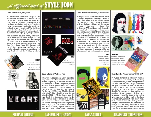
A 2016 survey of other artists’ work: Michael Bierut, Jacqueline S. Casey, Paula Scher and Bradbury Thompson. (One sheet created by WRE’s Christine G. Adamo, using Adobe InDesign)


There’s so more to great design than meets the eye. And that’s my point. If you never dare dig into a designer’s history, you’ll never know what brought them to the insights which now inform their signature style. You also do yourself a disservice, thinking they have some magical powers that’re entirely out of your reach.

We’re not all equally adept, but we all possess unique skills and perspectives.

EX 2 - Non-Western Design

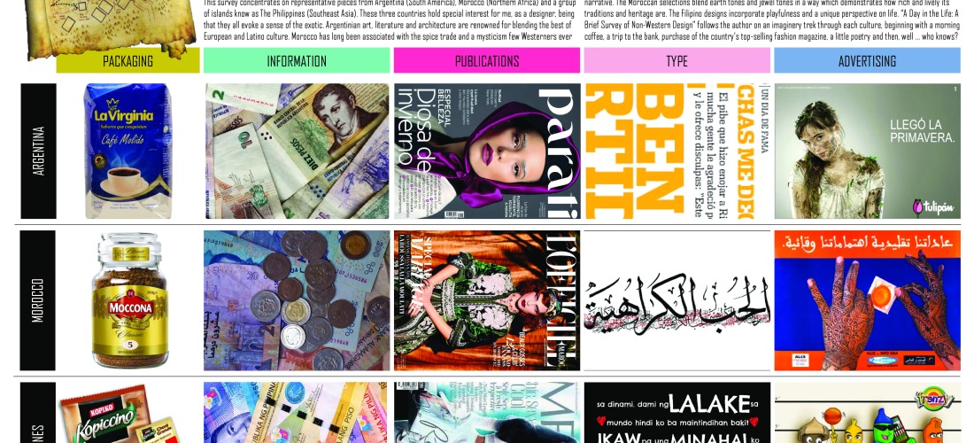
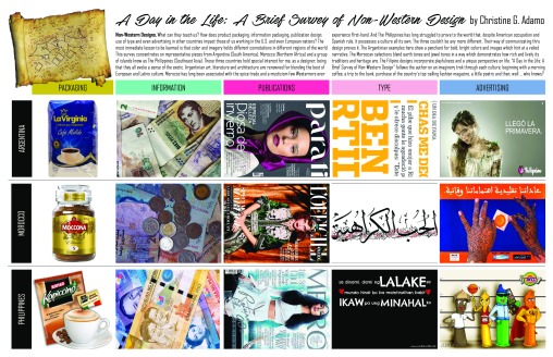
A 2016 survey of Non-Western designs in Product Packaging, Information, Publications, Type and Advertising in three countries: Argentina, Morocco and The Philippines. (One sheet created by WRE’s Christine G. Adamo, using Adobe InDesign)


Culture plays a role here, too. Consider “A Day in the Life” (above). This Non-Western design survey says a lot about the visual communication strategies, color schemes and ideals embraced by others. It even says something about the way humor is used in marketing tools aimed at entirely different markets.

Creating these layouts was a process in itself – one that’s informed by my own design style, history and heritage. The concepts of Contrast, Repitition, Alignment and Proximity heavily inform my work. (Thanks, Robin Williams! Don’t know who I’m referring to, look ‘er up.) It’s a challenge to achieve all four, but it’s worth it.

I dare you to conduct your own survey. I double dare you even!

Happy hunting,

Christine

Christine G. Adamo | Owner, Lead Writer & Designer | http://www.WriteReviseEdit.com